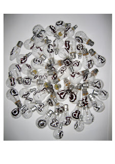
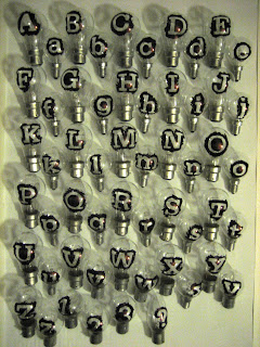
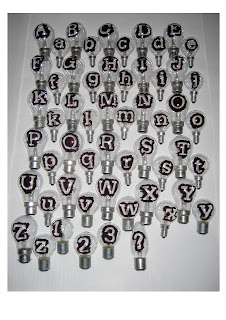
My object was a light bulb and my proposal was to experiment in creating a typeface using individual light bulbs as characters. My intention was not necessarily to create a practical or useable typeface but to simply experiment with the different qualiites that I could produce by stencilling or drawing letters directly onto the surface of the lightbulbs. It was unclear what was goin to happen and to say that it was entirely successful wouldn't be correct. To begin with the financial implication of this project soon began to be an issue, the first batch of bulbs nearly all blew as soon as I lit them up and then when it came to using spray paint to modify the next set of bulbs I made the mistake of buying water based paint which simply didnt dry on glass. However even after buying enamal based paint which did dry and looked ok when it came to lighting them up the paint began to burn and smoke which became quite dangerous and probably toxic. I was therefore forced to revert back to just simply drawing on the bulbs with permanent marker which was rather frustrating but necessary for the purposes of not getting poisoned.
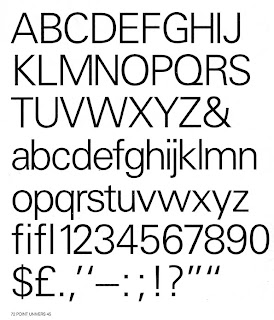
My choice of font to decorate the bulbs was 65 Serifa which one of the more bold fonts created by Frutiger using as always straight, uniformed lines and utilising white space. I wanted to explore the font in negative and focus on the distortion of the silhouette and using the curves of the bulbs themsleves. This changed the sanserif value of the font and accentuated the stokes defining the heavy, bold lines. The shapes created became apparent as a by-product of mark making and not the characters used. I looked at the later work of Christian Boltankski and responded to the face value in the exploration of shadows and illuminations. Following these attempts I felt let down by the practical limitation and the failure to project the font. I therefore returned to Frutigers use of uniformity and linear format utilising the font as a typeface or typeposter.


